There have been a few reports around the net about new features making their way into Windows Mobile 6.5. Features such as cursor magnification, larger UI Controls and some new ‘good lookin’ button bars. I decided I had better see what the fuss was about so I’ve now got the new build of Windows Mobile 6.5 running on a device to check out these new features.
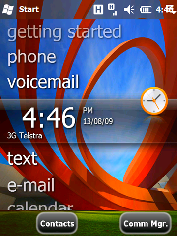
When you first boot into Windows Mobile 6.5 you are greeted with the new button bar at the bottom. From what I can tell the button bar is an unfinished version of the IE Button bar for all of Windows Mobile 6.5.
Welcome screen of Windows Mobile 6.5 with the new buttons. 


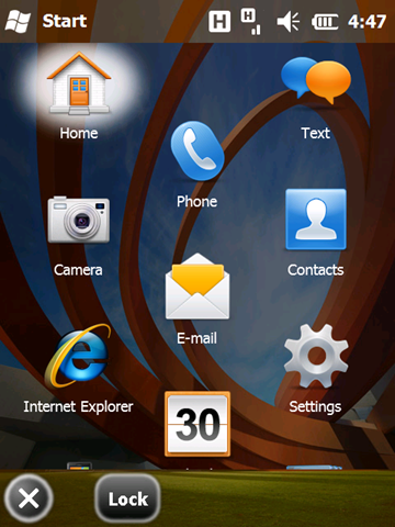
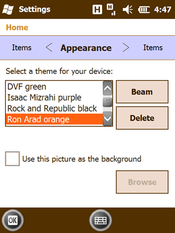
It seems that almost all of the default controls have been modified, tab controls are now some kind of flying slide control.
There is also a new magnifier cursor box that seems to pop up at the moment, always when you don’t need it and jumps around your finger like a small energetic dog. Unfortunately I could get it sit still when I was trying to take a screenshot of it. I can see it being a good feature, once it settles down.
It’s good to see some more underlying UI controls getting a facelift in Windows Mobile 6.5 but when on earth is this product going to market? Hopefully over the next few builds the UI receives the fit and finish it deserves and some of the new stability problems are fixed (although that could be the particular build I had).
