 A number of people have asked how exactly do we go about design the UI for MetroTwit, what it takes for a feature/idea to make it from a tweet/email to us to a release.
Our process is fairly simple… we fight… like brothers (we’re all in separate states so our fights are over WLM/Skype). That may sound like a bad way to design but it means we are actively fleshing out the details from each of our perspectives and experiences and our shared understanding of the outcome we’re trying to achieve.
Quite often there is no fight, we all agree on exactly how something should be implemeneted and it’s recorded for when we get to actually programming that feature. On the rare occasion it comes down to a majority vote as to how something should look/act. Usually when we get to this stage we’ve already asked numerous people for their opinions or had user polls etc.
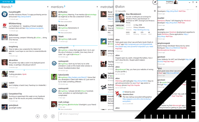
When it comes down to the exact design (the pixels that we know you all peek at when you change MetroTwit themes… you monsters) usually when coding a feature Winston (@winstonpang) and I will do the basic design/make it work and then let Long (@longzheng) make it look amazing. A lot of the design of MetroTwit comes down the basics we decided upon when starting MetroTwit. We wanted MetroTwit to look amazing no matter the DPI of your screen, something that WPF is made for. Due to this all of our resources (icons etc) are all vector paths and every style has had hours and hours getting them to be pixel perfect and a good implementation of the Metro design guidelines.
If a great looking app is something you’re trying to design, you can’t go past The Noun Project for great vector icons to help improve the sharpness and quality of your app. This has been a hard post to write as our process isn’t exactly follow 5 steps and you have something that looks good, but hopefully this has helped some app developers/designers.